Introduction
The pressure to refresh a website quickly often forces teams into the same frustrating cycle. You brief someone, wait for mockups, give feedback that gets partially interpreted, wait again, and somewhere in that process the original vision gets diluted. When Anthropic released Claude Design through Anthropic Labs earlier this week, we decided to cut that process entirely and test it directly on our own site. The premise is straightforward: describe what you want, get a working design back, and refine it through conversation until it matches your intent. No Figma, no design handoffs, no waiting. We were skeptical enough to want to see it ourselves, and what we found was worth writing about in detail.
While we were running this test, it became clear that this shift is not isolated. Teams are already starting to treat tools like Claude as part of their day-to-day design workflow rather than an experiment. A recent write-up from Jane Street describes a similar transition, where Claude is used directly in the design process instead of traditional tools like Figma. The pattern is consistent. The interface becomes less about manipulating layouts manually and more about describing intent clearly enough for the system to execute on it.
What Is Claude Design?
Claude Design is a new AI-powered design tool from Anthropic that generates visual interfaces, interactive prototypes, presentations, and one-pagers from a text prompt. It is part of Anthropic Labs, the company's experimental product arm, and it runs on Claude Opus 4.7, their most capable vision model released alongside it. What separates it from other AI generation tools is that the entire workflow is conversational and iterative. You describe what you need, review the output, identify what needs to change, and refine through chat until the result matches your intent. For teams that connect their codebase and design files during onboarding, Claude Design automatically applies the correct brand colors, typography, and component patterns to everything it produces. For smaller teams working without a formal design system, it works from a cold start just fine, though the output will be more generic by default. It is currently available in research preview for Pro, Max, Team, and Enterprise subscribers, with its own separate usage tracking and weekly limits that sit alongside your existing Claude plan rather than inside it.
The Claude Design Tool Review: Our Full Process
Many teams assume that AI design tools do the heavy lifting entirely on their own. This assumption leads to vague prompts and disappointing results. The reality is that Claude Design builds what you describe, so the quality of the output depends directly on the quality of the input. Treating the prompt like a proper design brief rather than a casual search query makes an immediate and noticeable difference in what comes back.
Writing the Prompt
The first thing we did was spend about 15 minutes writing a structured JSON prompt before touching the tool at all. Instead of describing the site in plain text, we defined the entire design system in code: color palette with primary, secondary, accent, and text values, border radius rules, box shadow parameters, button variants and sizes, heading hierarchy, icon style, and a full website schema that mapped out every section from header to footer with its components and layout logic.
Here's a small slice of what that JSON prompt actually looked like:
1{2 "design system": {3 "pallete": {4 "primary": "#191265",5 "accent": "linear-gradient(to right, var(--primary), var(--primary-light))",6 "background": "#ffffff"7 },8 "components": {9 "button": {10 "sizes": ["small", "medium", "large"],11 "variants": ["primary", "secondary"],12 "notes": "All options fully rounded. Primary has primary bg. Secondary has white bg"13 },14 "icon": {15 "variants": ["dot", "solid"],16 "notes": "All icons should be dotted so icon completely consists from dots that create an icon shape"17 }18 },19 "websiteSchema": {20 "hero": {21 "components": ["Container", "Label", "H1", "Text", "Button"],22 "structure": "Hero block is 'contrastBlock' type. Container inside, then label, h1, text and button large secondary option"23 }24 }25 }26}
This is a partial excerpt. The full prompt covers all eight sections, from header to footer, with complete component and layout logic. Message us on LinkedIn and we'll send it over, or book a quick call if you'd rather talk through how it fits your project first
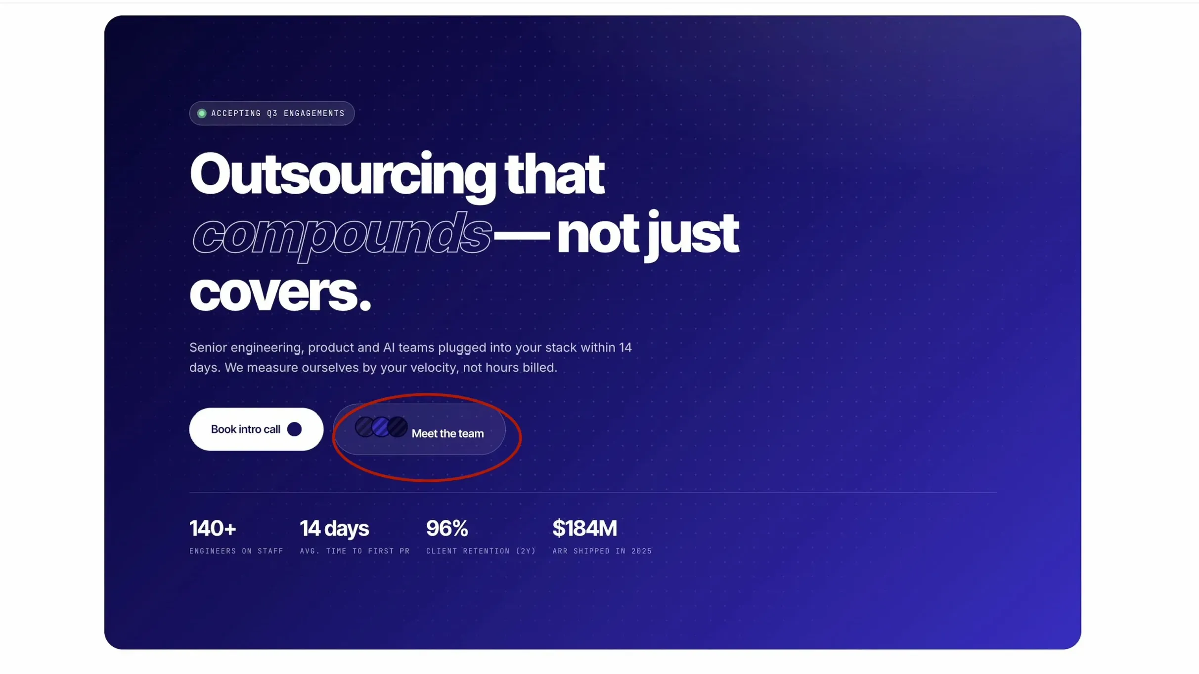
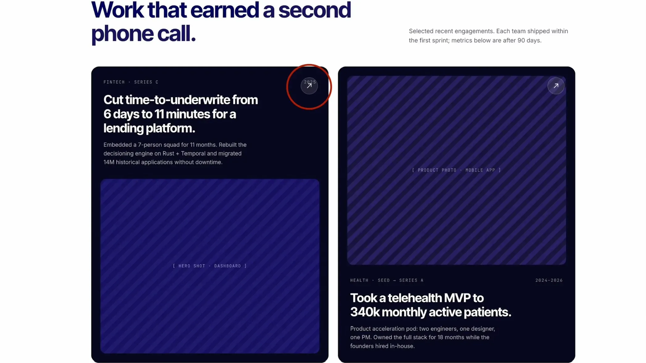
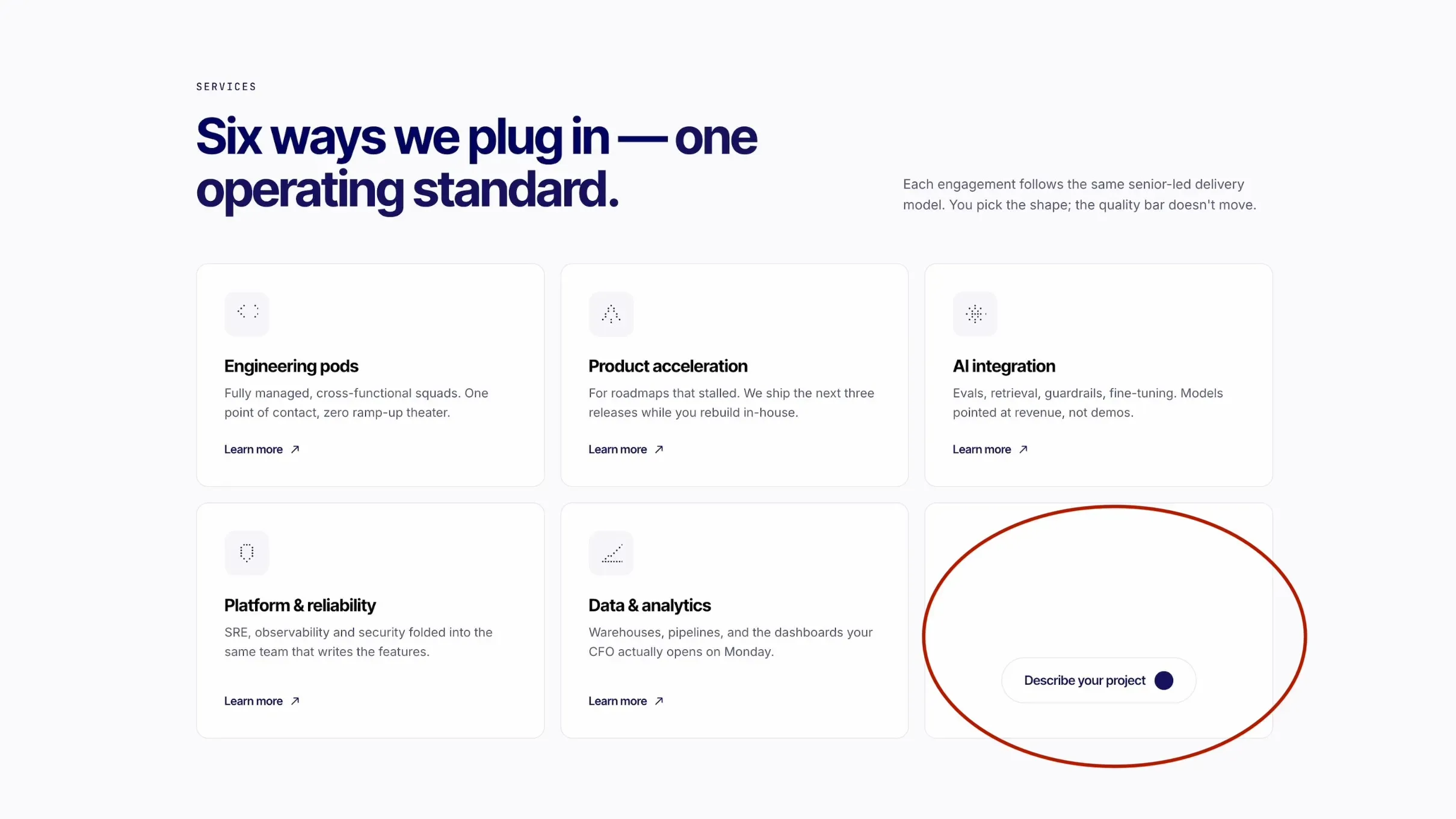
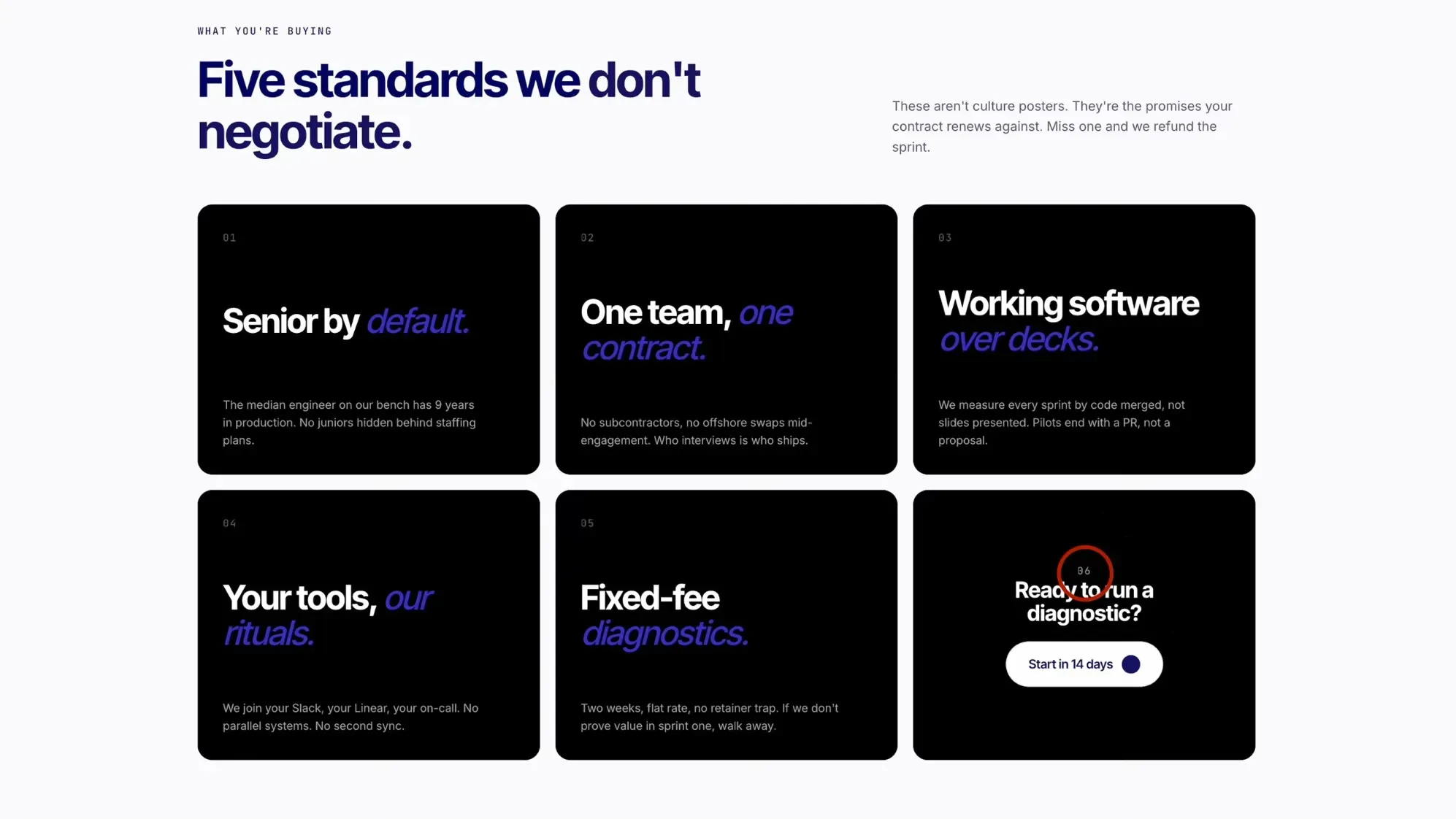
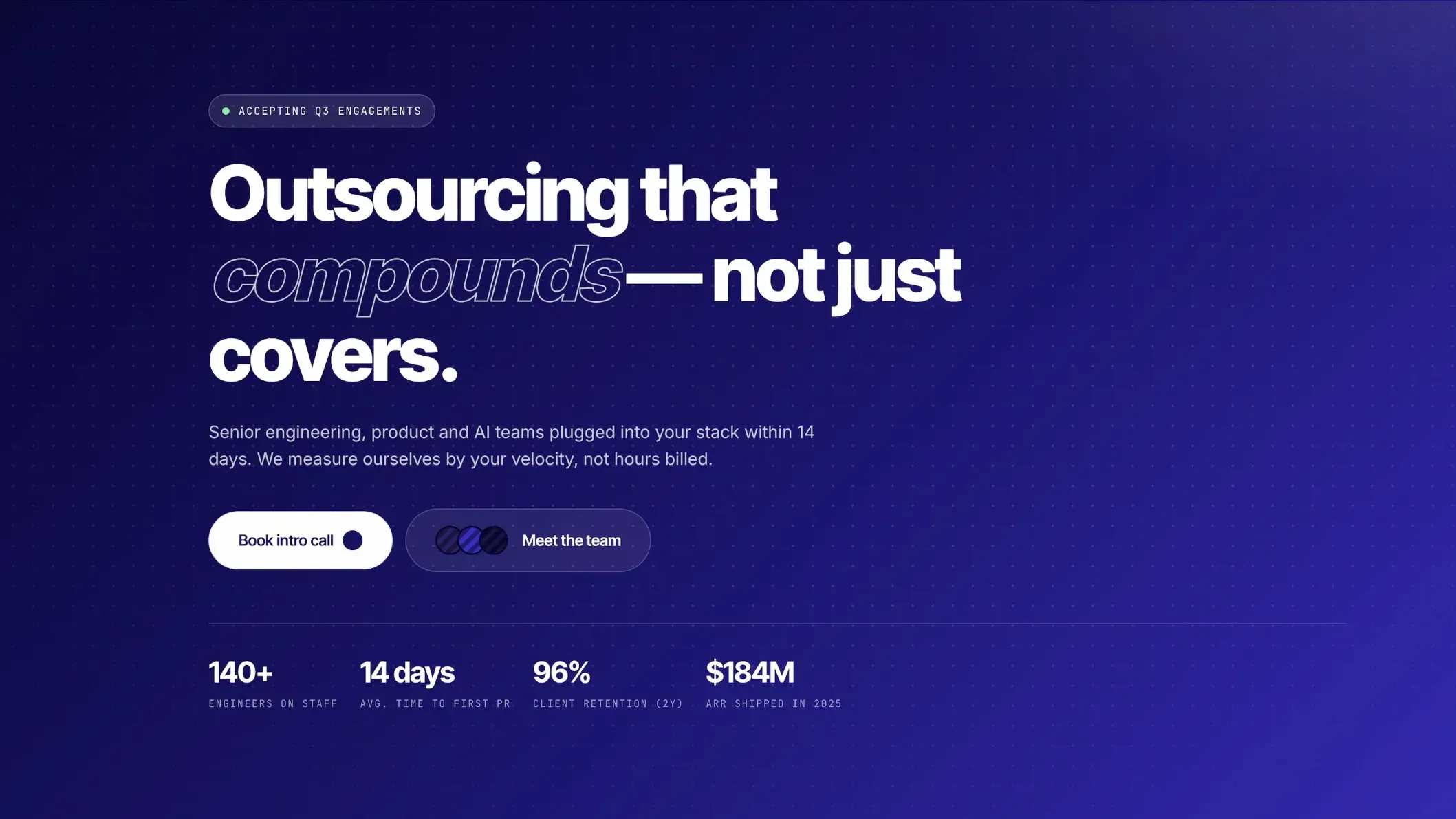
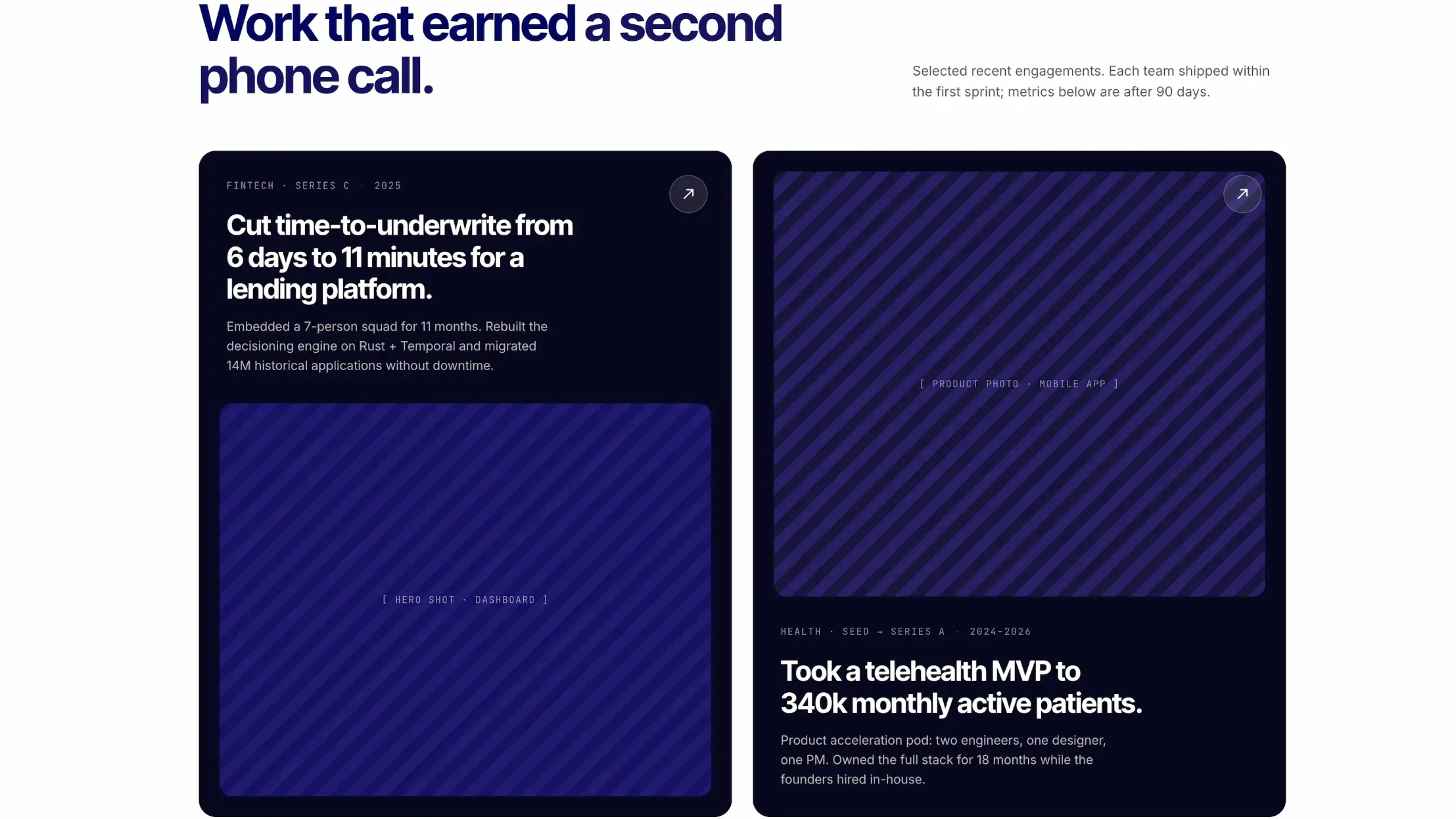
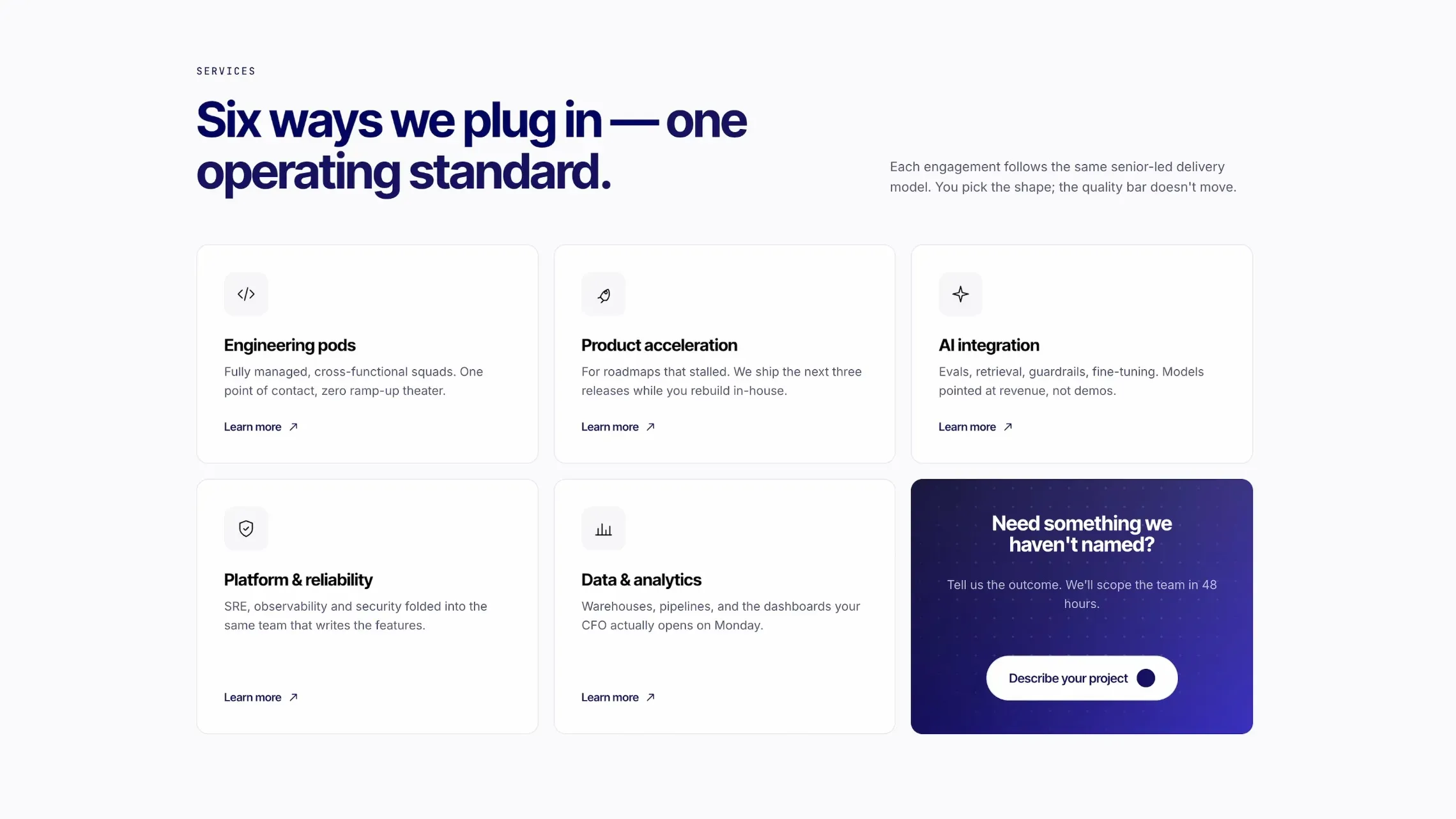
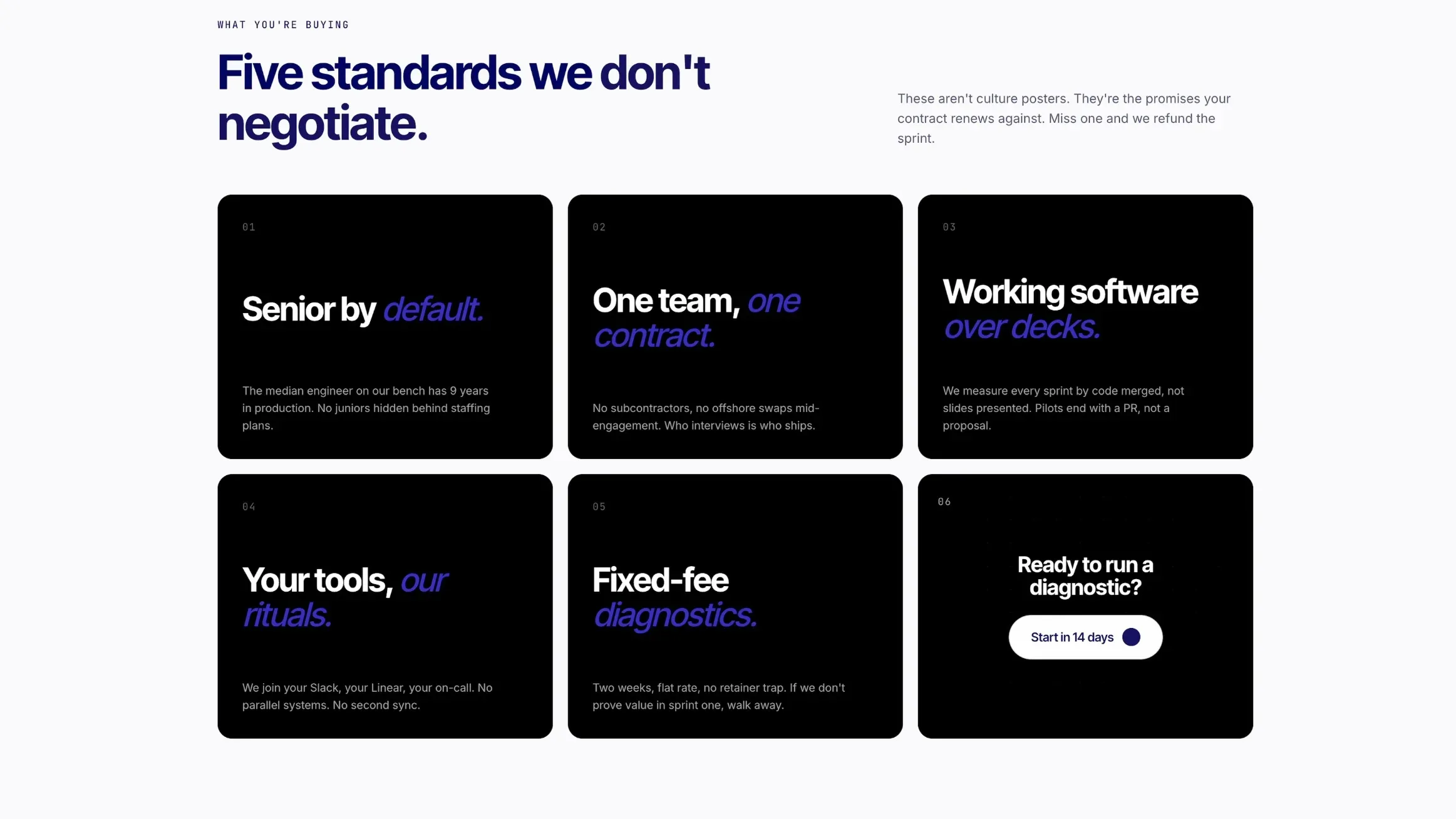
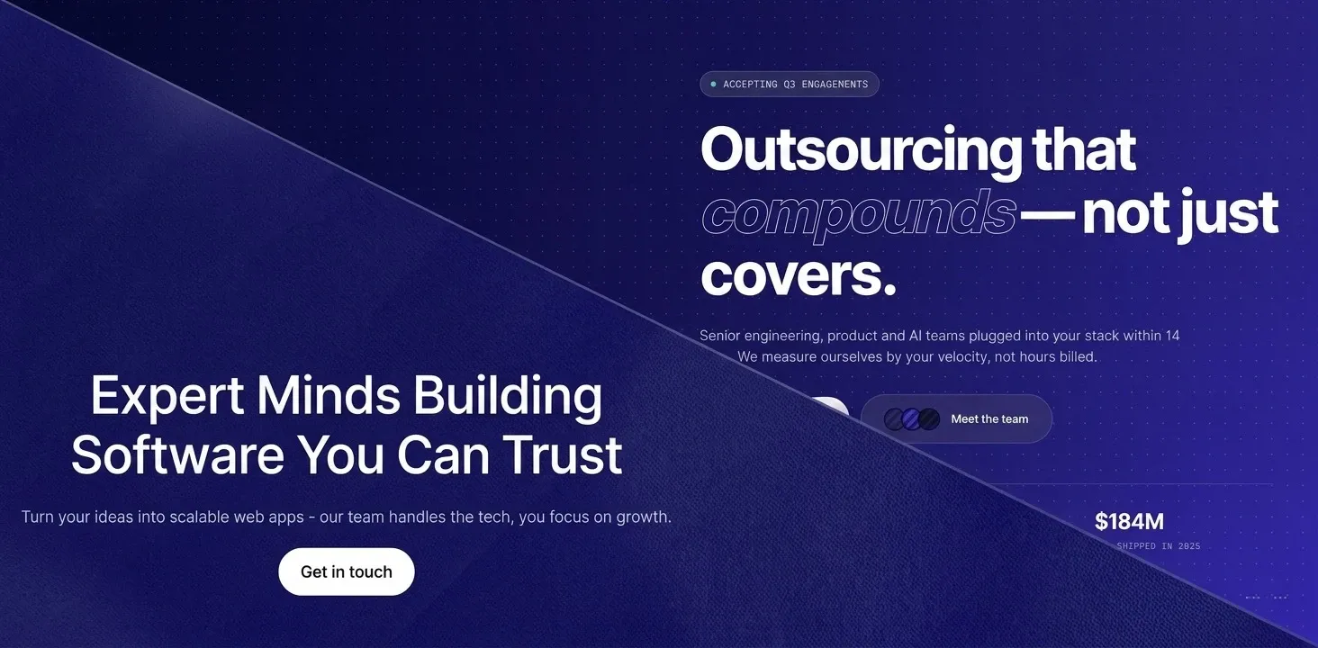
The schema covered eight sections in total. The header included a logo, navigation with a dropdown for solutions, and a primary CTA button. The hero was defined as a contrast block with a label, H1, description, and a large secondary button. Below that we described case study cards, a services grid with six cards and dotted-style icons, a results block split into a text column and a testimonial grid, a values section with six numbered cards, a partner logo strip with infinite scroll, a toggleable FAQ, and a footer with a citation block and a contrasted CTA section.
The level of specificity in the prompt is what made the first generation come back as close to the intended result as it did. Claude Design builds what you describe, and the more precisely you define the structure, hierarchy, and visual logic upfront, the less refinement work you need afterward.